5 Models for Nonstationary Time Series
5.1 5.1
5.2 5.2
5.3 5.3
5.4 5.4
5.5 5.5
5.6 5.6
5.7 5.7
5.8 5.8
5.9 5.9
5.10 5.10
5.11 Winnebago
a
The plot in 5.1 has a trend that seems almost exponential, as well as a seasonal pattern by which sales seem to slump later in the year and surge in the spring months.
data(winnebago)
winnebago <- as.xts(winnebago)
xyplot(winnebago, ylab = "Sales")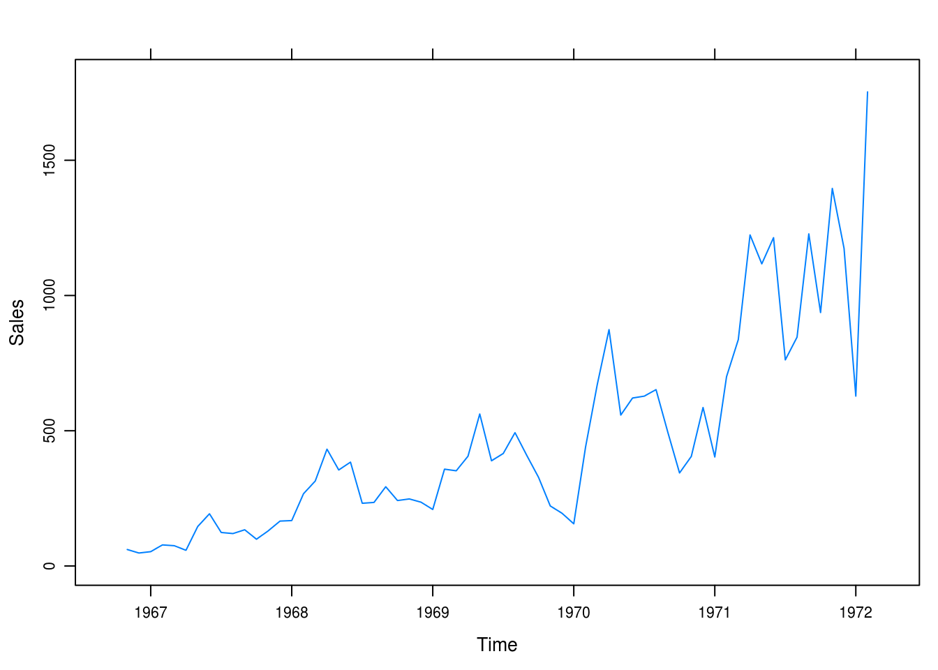
Figure 5.1: Monthly unit sales of recreational vehicles.
b
We take the log of sales and it looks like we have made the trend linear in time 5.2
winnebago_log <- log(winnebago)
xyplot(winnebago_log, ylab = expression(log(sales)))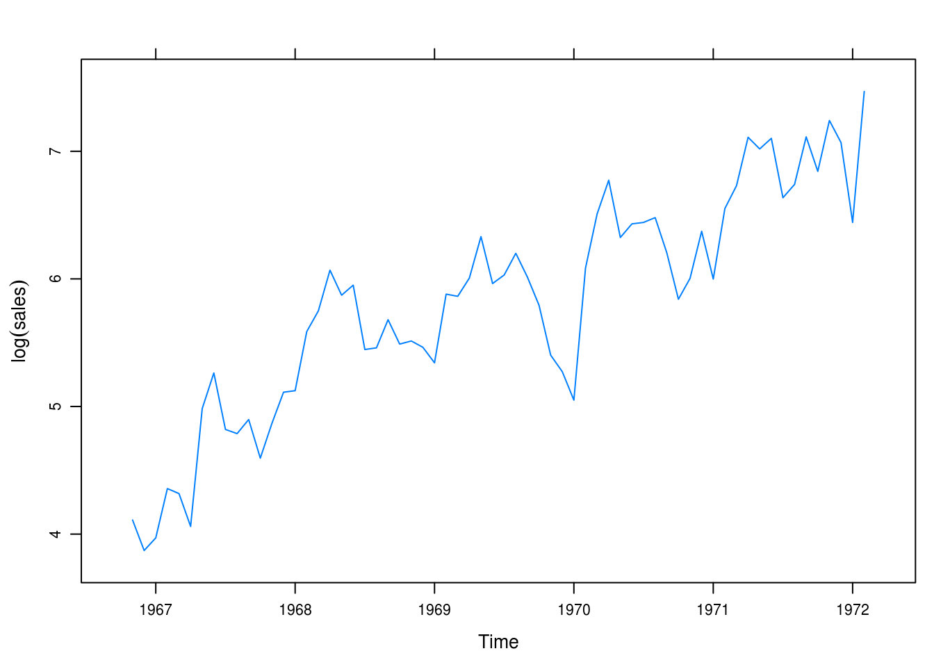
Figure 5.2: Logged monthly sales.
c
We produce the result in figure 5.3. The patterns are similar but it seems like the fractional relative changes are greater in magnitude for the larger values of sales
winnebago_frac <- diff(winnebago) / lag(winnebago, 1)
winnebago_logdiff <- diff(log(winnebago))
winnebago_comp <- merge.xts(frac = winnebago_frac, logdiff = winnebago_logdiff)
xyplot(winnebago_comp, screens = c(1, 1), auto.key = TRUE,
       ylab = "Sales",
       col = c("darkorange2", "navy"))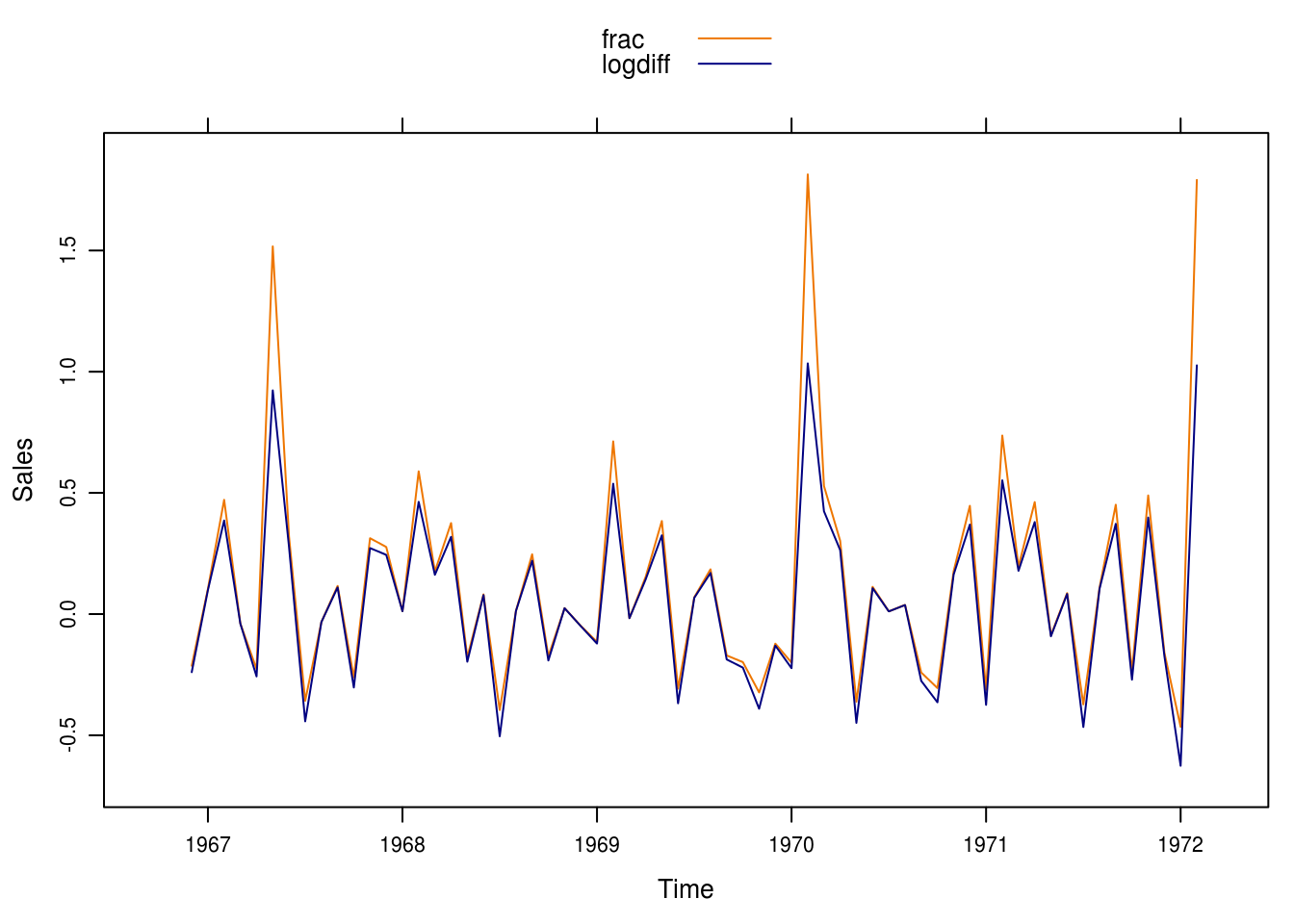
Figure 5.3: Comparison between differences of logs and fractional relative changes.
5.12 Standard & Poor
a
There is an exponential trend in the time series (Figure 5.4) that, however, seems to perhaps level off after 1970 or so.
data(SP)
SP <- as.xts(SP)
xyplot(SP, grid = TRUE)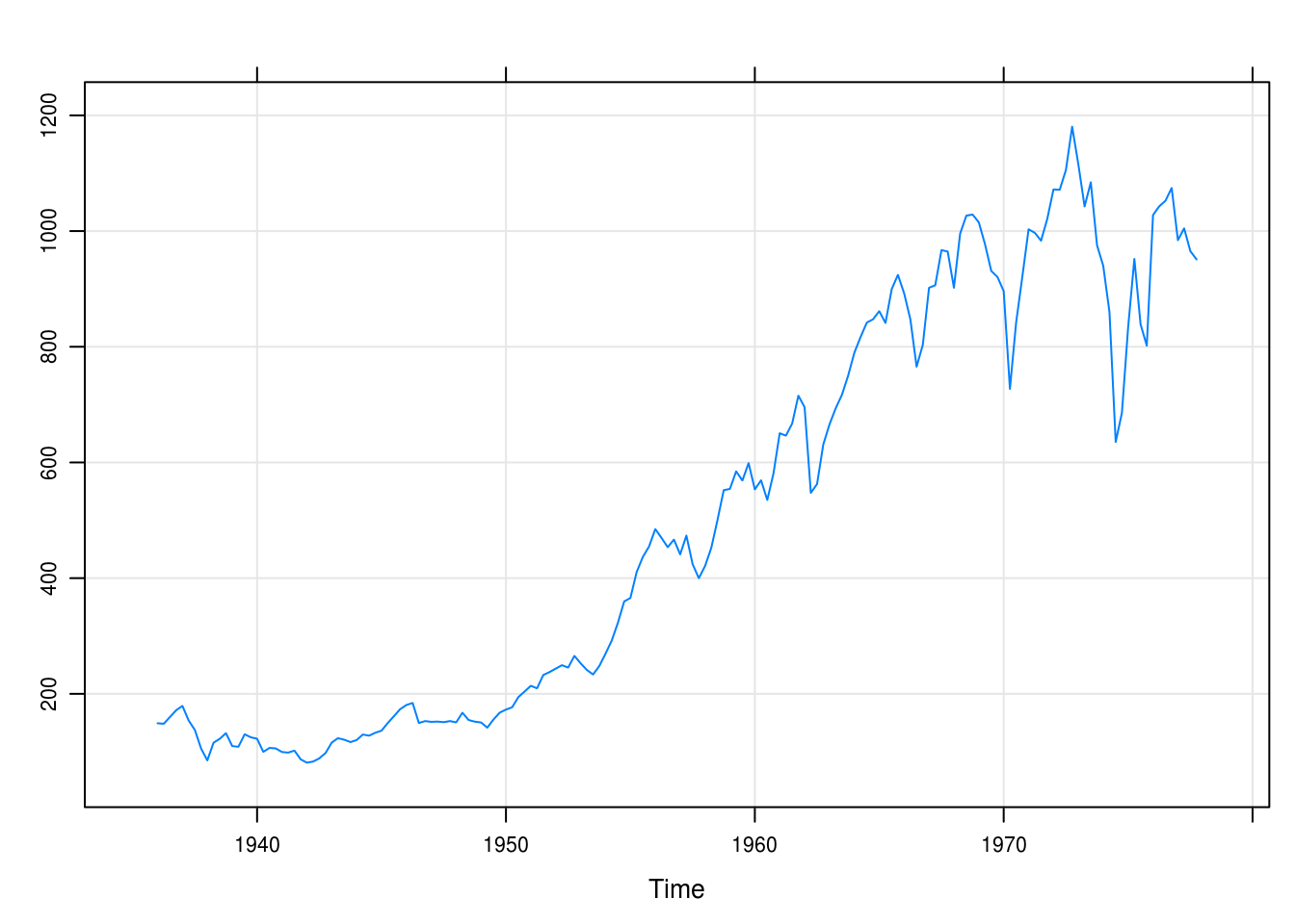
Figure 5.4: Quarterly values of the Standard and Poor index.
b
In Figure 5.5 we’ve transformed the time series of the S&P index by taking the log. The series is “more” linear but there is still an exponential pattern.
sp_log <- log(SP)
xyplot(sp_log, ylab = expression(log(value)), grid = TRUE)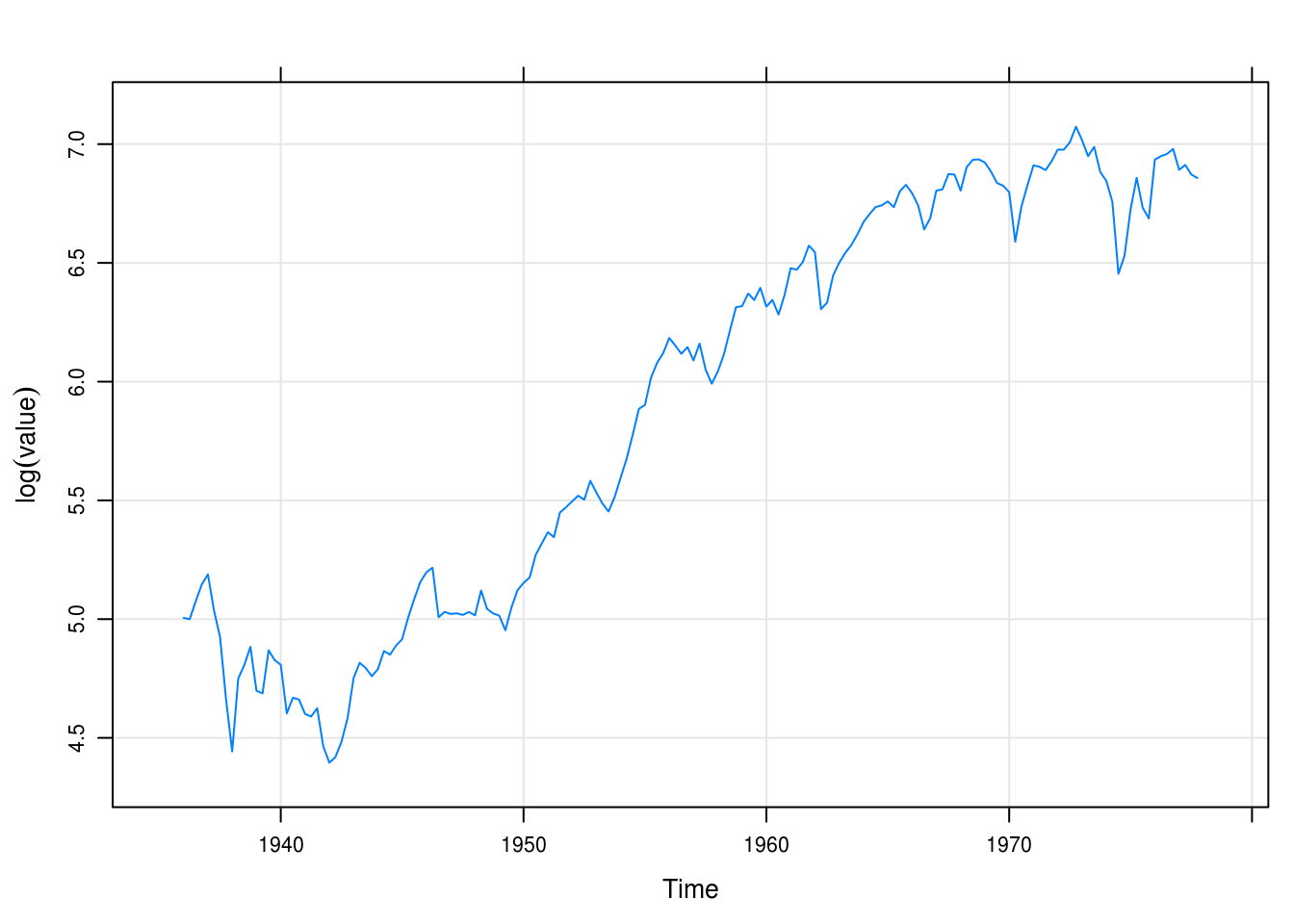
Figure 5.5: Logged values of the Standard and Poor’s index.
c
Next, we compute the fractional relative changes and the differences of natural logartihms (Figure 5.6). We see that there is little difference between the series and only really so for the higher numbers of sales.
SP_frac <- diff(SP) / lag(SP, 1)
SP_logdiff <- diff(log(SP))
SP_comp <- merge.xts(frac = SP_frac, logdiff = SP_logdiff)
xyplot(SP_comp, screens = c(1, 1), auto.key = TRUE,
       ylab = "Sales",
       col = c("darkorange2", "navy"))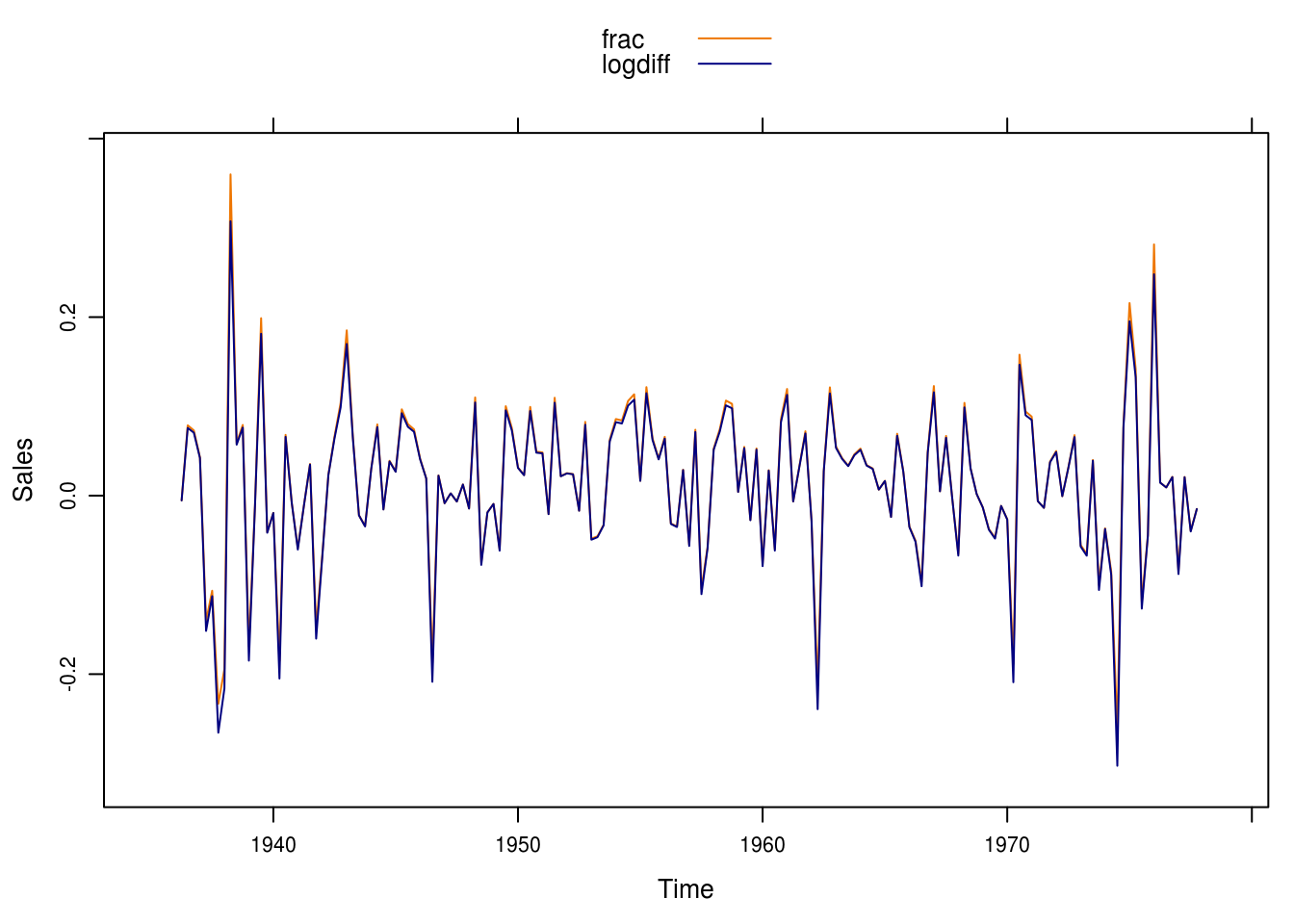
Figure 5.6: Differences in logs and fractional relative differences.
5.13 Air passengers
a
We plot the monthly intervational airline passenger counts in Figure5.7 and note that we have a strong seasonal trend and perhaps a slight exponential increase. Variance seems to increase as well.
data(airpass)
airpass <- as.xts(airpass)
xyplot(airpass, ylab = "Passengers")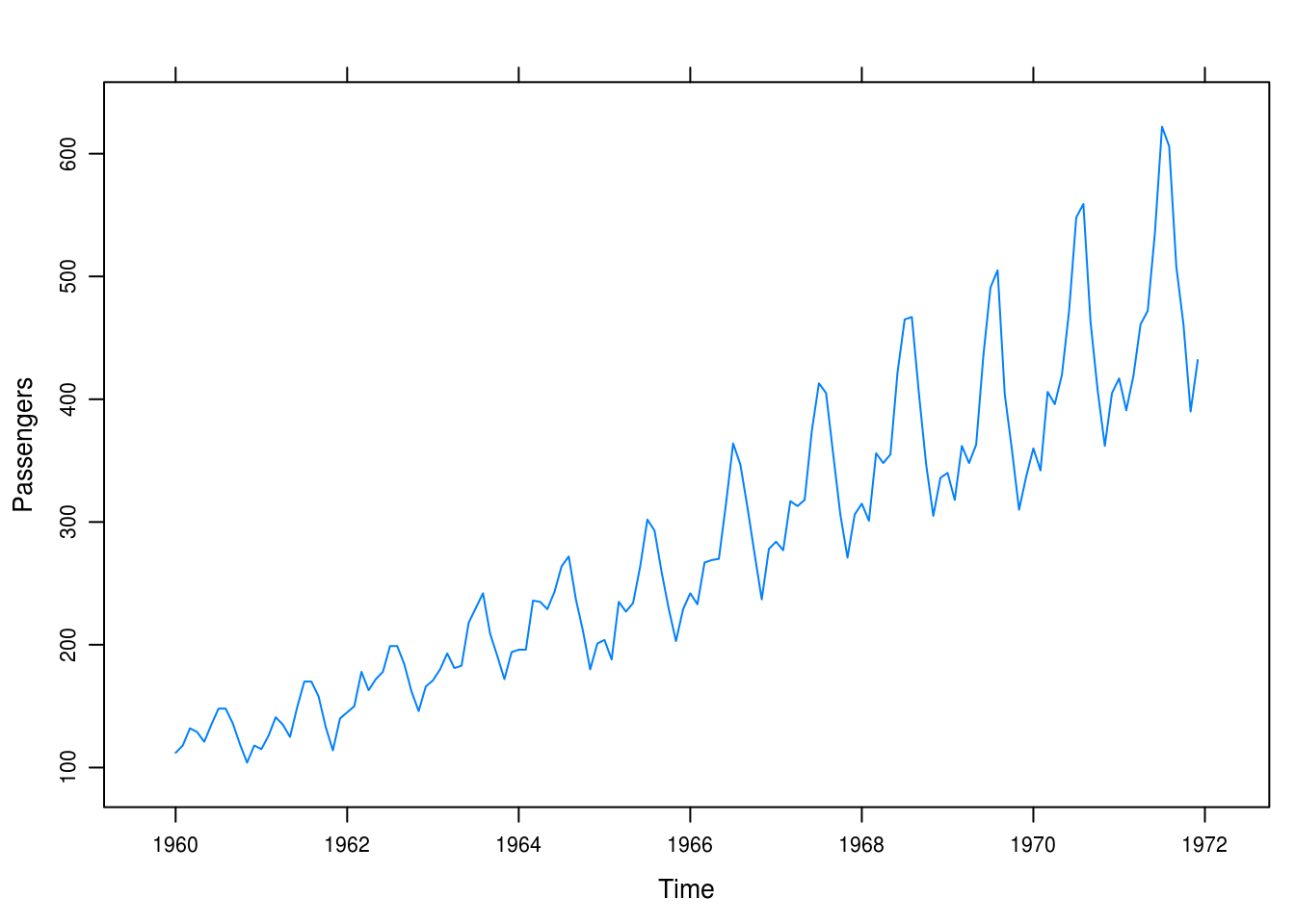
Figure 5.7: Monthly airline passenger totals.
b
As in previous exercises, we take the natural log of the dependent variable, in this case passenger totals, and note that we have made the trend linear (or maybe exponentially decreasing?) but notably have stabilized the variance of the series.
airpass_log <- log(airpass)
xyplot(airpass_log, ylab = expression(log(airpass)))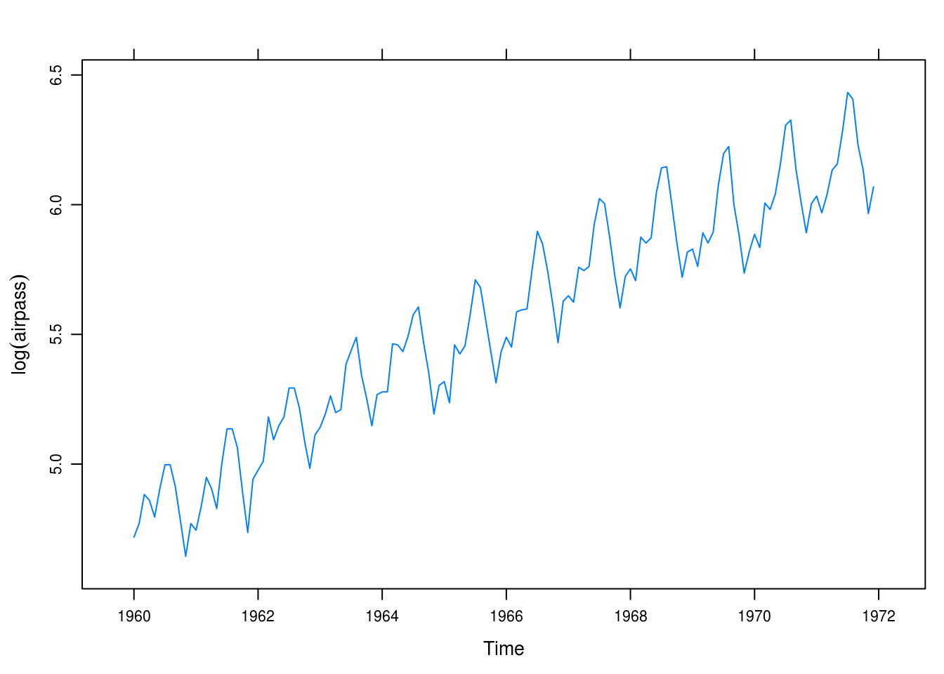
Figure 5.8: Logged monthly airline passenger totals.
c
Next, we compute the fractional relative changes and the differences of natural logartihms (Figure 5.6). We see that there is little difference between the series and only really so for the higher numbers of sales.
airpass_frac <- diff(airpass) / lag(airpass, 1)
airpass_logdiff <- diff(log(airpass))
airpass_comp <- merge.xts(frac = airpass_frac, logdiff = airpass_logdiff)
xyplot(airpass_comp, screens = c(1, 1), auto.key = TRUE,
       ylab = "Sales",
       col = c("darkorange2", "navy"))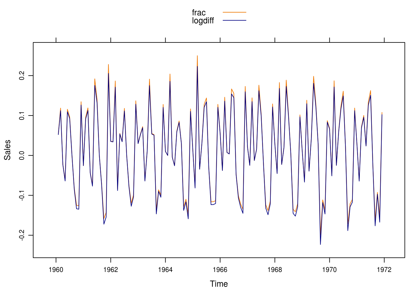
Figure 5.9: Differences in logs and fractional relative differences.
5.14 Rainfall
a
In this exercise we consider annual rainfall data for Los Angeles. We use TSA::BoxCox.ar() to train a power model to the time series (Figure 5.10), optimizing via lok-likelihood maximization.
data(larain)
larain <- as.xts(larain)
obj <- BoxCox.ar(larain)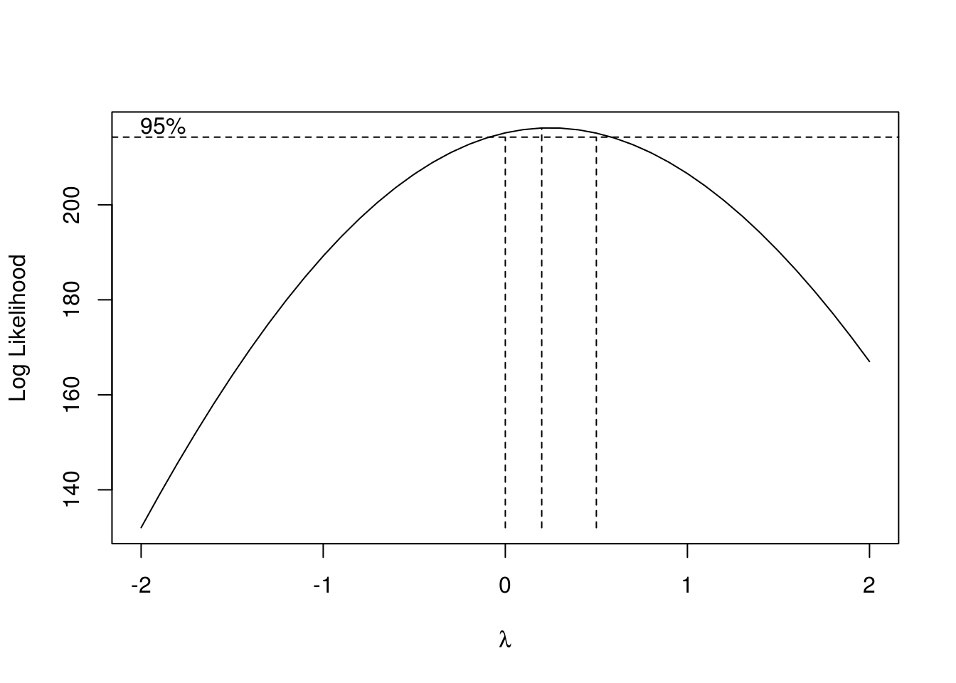
Figure 5.10: Box-Cox training on the annual rainfall data.
lambda <- obj$lambda[which.max(obj$loglike)]The best value of \(\lambda\) is 0.2.
b
We apply the power transformation and see the results of Q-Q plots for both the untransformed and the transformed time series in Figure 5.11
larain_trans <- larain ^ lambda
xyplot(list(Untransformed = larain, Transformed = larain_trans),
       FUN = qqmath, y.same = FALSE)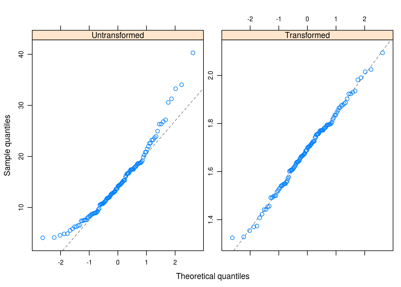
Figure 5.11: Q-Q plots of untransformed and transformed time series data.
d
Next we plot \(Y_t\) versus \(Y_{t-1}\) in Figure 5.12 – no correlation is evident from this picture, nor would we expect that our transformatin would induce any given that it is not at all based on the previous values.
xyplot(zlag(larain_trans) ~ larain_trans,
       ylab = "Lag 1",
       xlab = "Lag 0")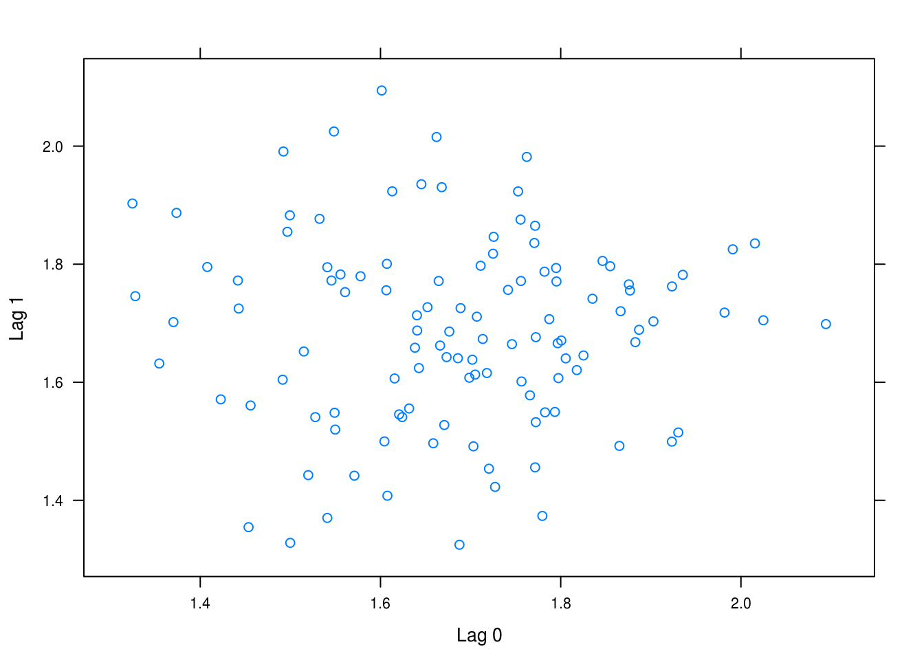
Figure 5.12: Lag 0 against lag 1.