Visualizing Euler diagrams with eulerr
Johan Larsson
2026-07-01
Source:vignettes/visualization.Rmd
visualization.RmdOnce we have ascertained that our Euler diagram fits well, we can turn to visualizing the solution. For this purpose, eulerr relies on the grid graphics system (R Core Team 2017) and offers intuitive and granular control over the output.
Plotting the ellipses is straightforward using the parametrization of a rotated ellipse,
where .
Most users will also prefer to label the ellipses and their intersections with text and this, however, is considerably more involved.
Labeling
Labeling the ellipses is complicated since the shapes of the intersections often are irregular, lacking well-defined centers; we know of no analytical solution to this problem. Instead, eulerr uses the pole of inaccessibility algorithm (Mapbox 2018) (originally from Mapbox’s polylabel C++ library), implemented in the eunoia Rust crate that powers eulerr’s geometry layer.
When a label is too large to fit inside its region’s polygon,
eulerr falls back to one of three exterior-placement
strategies, all delegated to eunoia. The strategy is
selected via labels$placement:
-
"raycast"(the default) - labels are placed along the ray from the diagram centroid through the region’s pole of inaccessibility, padded away from the diagram by a per-region margin. Closed-form, fast, deterministic.
"force_directed"- initial positions come from the raycast geometry, then a damped spring-and-repulsion solver relaxes the labels against each other and against foreign region polygons. Useful when several labels would otherwise collide or drift across unrelated regions.
"elbow"- labels are assigned to a left or right column outside the diagram, stacked vertically without overlap and reached by an orthogonal three-segment (“elbow”) leader. Reminiscent of d3-pie style callouts.
In every case, a leader line is drawn from the source region to the
exterior label; tether and leader styling are controlled via
labels$tether, labels$gap, and
labels$leader.
set.seed(1)
# A chain of four sets with long names and very small overlaps — the
# overlap regions are too narrow to fit their quantity labels inside,
# so all three strategies push the overlap labels to the exterior.
fit <- euler(c(
  Animalia = 8,
  Plantae = 7,
  Fungi = 6,
  Bacteria = 5,
  "Animalia&Plantae" = 0.05,
  "Plantae&Fungi" = 0.05,
  "Fungi&Bacteria" = 0.05,
  "Animalia&Bacteria" = 0.05
))
The raycast strategy places labels along rays from the diagram centroid, padded away from the diagram by a per-region margin.
plot(
  fit,
  quantities = TRUE,
  labels = list(placement = "force_directed"),
  main = "force-directed"
)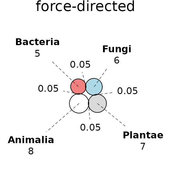
The force-directed strategy relaxes labels against each other and against foreign region polygons, which is useful when several labels would otherwise collide or drift across unrelated regions.
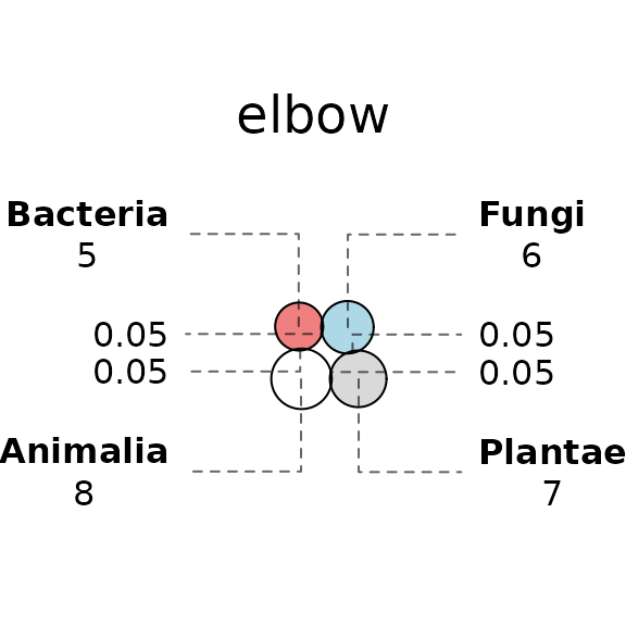
The elbow strategy stacks exterior labels in left/right columns reached by an orthogonal three-segment leader, in the style of d3-pie callouts.
Strategy-specific knobs live in their own sublists. The
force-directed solver takes
labels$force_directed = list(iterations = ...) and the
elbow placement takes
labels$elbow = list(margin = ..., min_gap = ...), where
min_gap sets the minimum vertical centre-to-centre spacing
between stacked label boxes in a column:
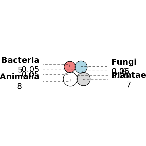
Elbow leaders with extra vertical breathing room between labels
Aesthetics
Euler diagrams display both quantitative and qualitative data. The quantitative aspect is the quantities or sizes of the sets depicted in the diagram and is visualized by the relative sizes, and possibly the labels, of the areas of the shapes—this is the main focus of this paper. The qualitative aspects, meanwhile, consist of the mapping of each set to some quality or category, such as having a certain gene or not. In the diagram, these qualities can be separated through any of the following aesthetics:
- color,
- border type,
- text labeling,
- transparency,
- patterns,
or a combination of these. The main purpose of these aesthetics is to separate out the different ellipses so that the audience may interpret the diagram with ease and clarity.
Among these aesthetics, the best choice (from a viewer perspective) appears to be color (Blake 2016), which provides useful information without extraneous chart junk.
The issue with color, however, is that it cannot be perceived perfectly by all. Eight percent of men and 0.4% of women in European Caucasian countries, for instance, suffer the most common form, red–green color deficiency. Moreover, color is often printed at a premium in scientific publications and adds no utility to a diagram of two shapes.
For these reasons, eulerr defaults to distinguishing ellipses with color using a manually tuned color palette.
set.seed(2)
con <- c(
  A = 1,
  B = 1,
  C = 1,
  D = 1,
  E = 1,
  F = 1,
  G = 1,
  H = 1,
  "A&B" = 0.2,
  "B&C" = 0.2,
  "C&D" = 0.2,
  "D&E" = 0.2,
  "E&F" = 0.2,
  "F&G" = 0.2,
  "G&H" = 0.2
)
plot(euler(con), labels = as.character(1:8))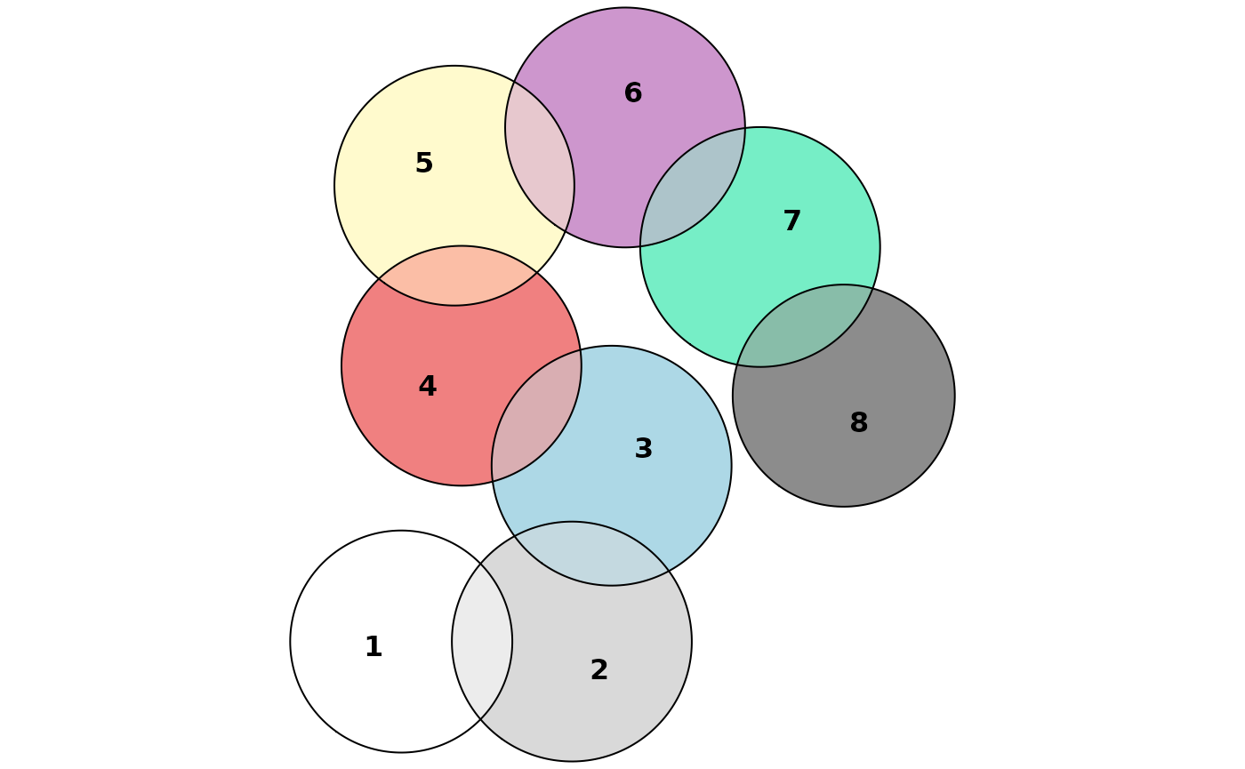
The eight first colors of the default color palette
Composing diagrams
Several Euler diagrams can be arranged into a single figure using
operator syntax inspired by the patchwork package. The
| operator place plots side by side, while /
stacks them vertically.
p1 <- plot(euler(c(A = 1, B = 8, "A&B" = 1)), main = "First")
p2 <- plot(euler(c(A = 1, C = 1, "A&C" = 1)), main = "Second")

p1 | p2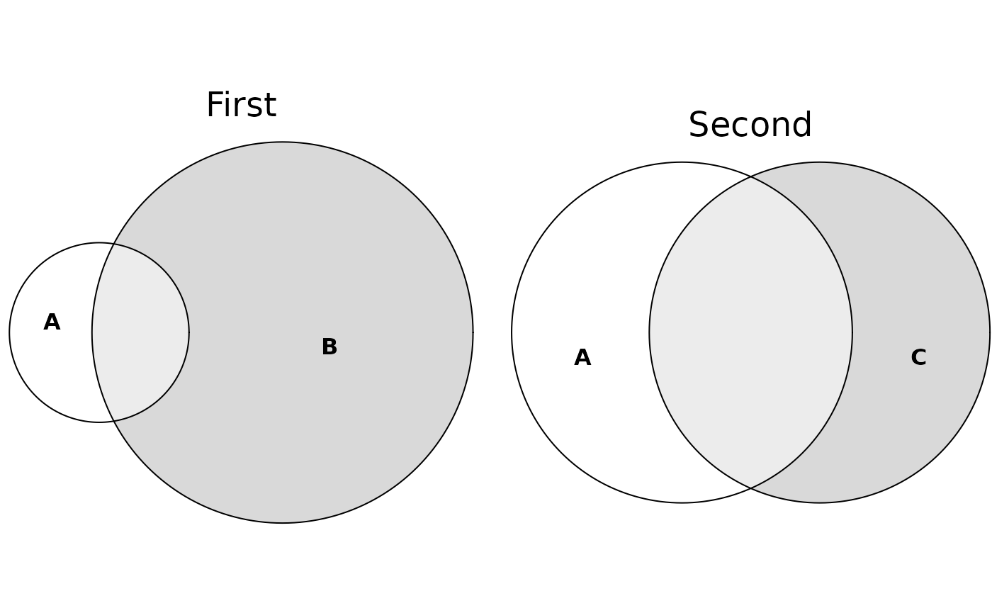
Two diagrams arranged side by side
Each operator returns an eulergram, so compositions nest
freely:
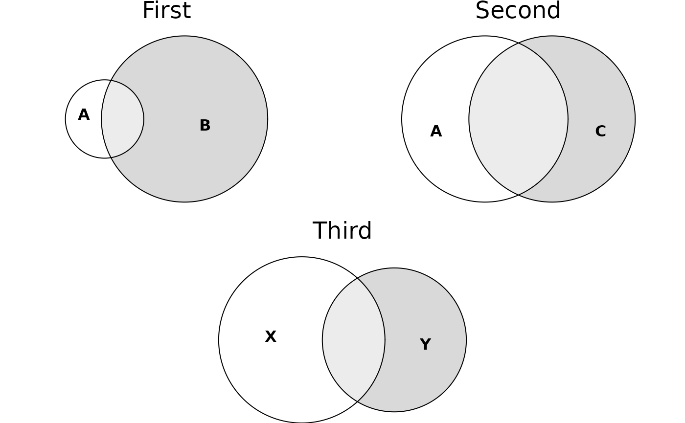
Nested composition: two plots on top, one below
Individual panels can be titled with the main argument
to plot(), as above. The gap between adjacent plots is
controlled by the composition$spacing entry of
eulerr_options():
eulerr_options(composition = list(spacing = grid::unit(2, "lines")))
p1 | p2
Normalizing dispersed layouts
If there are disjoint clusters of ellipses, the optimizer will often spread these out more than is necessary, wasting space in our diagram. To tackle this, we use a SKYLINE-BL rectangle packing algorithm (Jylänki 2010) designed specifically for eulerr. In it, we surround each ellipse cluster with a bounding box, pack these boxes into a bin of appropriate size and aspect ratio, and adjust the coordinates of the ellipses in the clusters to compact our diagram. As a bonus, this increases the chance of having similar layouts for different function calls.